

In luxury real estate, paint color is more than a backdrop, it’s a statement of taste, mood, and value. The right shades can elevate a space, enhance architecture, and create the emotional connection that drives a buyer to say, “This is it.” Whether you’re staging a multimillion-dollar estate or designing a new custom home, the paint color choices you make can be crucial in positioning a property for sale.
Greige
Greige, a blend of gray and beige, has become the gold standard of luxury neutrals. It feels warm, soft, and endlessly adaptable. It offers a perfect middle ground between the coolness of gray and the warmth of beige. This color works in just about any space, whether it’s an open-plan living room, a modern farmhouse kitchen, or a luxurious study. For a refined look, shades like Farrow & Ball’s Skimming Stone, Benjamin Moore’s Revere Pewter, or Sherwin-Williams’ Agreeable Gray are ideal. These subtle tones add depth to a room without overpowering it, creating a sophisticated, calming atmosphere.

Soft White
White is often seen as the epitome of elegance. It reflects light, enlarges space, and offers a gallery-like backdrop for art, views, or high-end furnishings. When selecting white for a luxury home, you want to avoid anything too stark or sterile. Benjamin Moore’s Chantilly Lace is a crisp, pure white that works wonderfully in large spaces with plenty of natural light. If you prefer a slightly warmer tone, Farrow & Ball’s Pointing offers a classic, inviting warmth. For those seeking a soft, creamy hue, Sherwin-Williams’ Alabaster is an excellent choice. Soft whites are ideal for high-ceiling foyers, coastal homes, and contemporary interiors, where a clean, minimal aesthetic is desired.
Blues and Grays
Dark colors signal drama, intimacy, and confidence, which is why moody blues and charcoal grays are often used in luxury real estate to create a sense of depth and elegance. These shades can be used to add a striking focal point in a room or to create a sophisticated backdrop that highlights art and furniture. A deep navy like Farrow & Ball’s Railings creates a rich, timeless effect that’s perfect for spaces like dining rooms, libraries, or home offices. Benjamin Moore’s Hale Navy is another excellent choice for those seeking a classic navy tone. For a more modern and edgy feel, Sherwin-Williams’ Iron Ore, a bold charcoal gray, works beautifully in smaller rooms like powder rooms or accent walls.

Earthy Taupes and Clay Tones
Nature-inspired tones are making a strong comeback, and earthy taupes and clay tones bring warmth and an organic feel to luxury interiors. These colors evoke feelings of relaxation and comfort, offering a grounding effect while still maintaining an air of sophistication. Shades like Benjamin Moore’s Natural Cream and Sherwin-Williams’ Accessible Beige are warm, welcoming, and versatile. For a more contemporary twist, Farrow & Ball’s Jitney is a beautiful clay hue that adds depth and richness without feeling heavy. These earthy tones are particularly ideal for desert homes, wellness retreats, and minimalist-modern interiors, where a calm, nature-infused atmosphere is key.
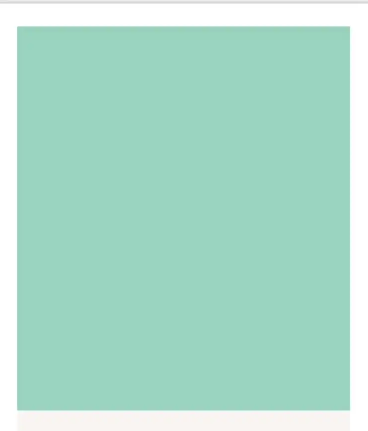
Soft Blues and Seafoam Greens
Soft blues and seafoam greens are the colors of coastal luxury. These shades bring a fresh, calming energy to any space, making them perfect for beach homes and properties with stunning water views. Benjamin Moore’s Palladian Blue is a soft, airy hue that adds a touch of sophistication without overwhelming the space. For a serene and soothing vibe, Farrow & Ball’s Light Blue works beautifully in bedrooms and bathrooms. Sherwin-Williams’ Sea Salt is another excellent choice, offering a blend of soft green and blue that evokes the tranquility of the sea. These shades are perfect for coastal or lakeside retreats, creating a serene atmosphere that complements the natural beauty of the surroundings.
Warm Black and Soft Ebony
Black is an underrated color in luxury interiors. It exudes sophistication, refinement, and timelessness, especially when used in accents or as an unexpected backdrop. A warm black like Benjamin Moore’s Black Satin or Sherwin-Williams’ Tricorn Black can create a dramatic effect when used on kitchen islands, front doors, or window frames. For a softer, more organic touch, Farrow & Ball’s Off-Black brings depth and complexity without feeling too harsh. These dark hues work especially well in modern or industrial-style homes, where bold contrasts and statement pieces are key elements of the design.
In luxury real estate, it’s essential to make thoughtful color choices that enhance the space rather than overwhelm it. Pair your chosen hues with high-end finishes like matte paint and brass hardware to create instant luxury. Consider how light will interact with your colors – south-facing rooms can handle cooler tones, while dim spaces may need warmer hues to bring balance. It’s also important not to overdo it. Luxury is subtle. Bold colors work best as accents rather than being applied to every surface in the home. And before making a final decision, always test paint samples on large boards and observe how the colors shift in different lighting conditions throughout the day.
